Hurray for more working poor?
Hurray for more working poor?
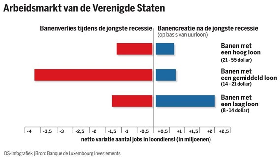
In the US all indicators look brightly. One of the important indicators is the job growth. It looks like that economic growth now finally means job growth. But what kind of jobs have been created?
This chart gives some surprising answers.
The red bars indicate the loss of jobs during the last recession. The highest bar shows the loss of jobs with a high wage 21-55 dollar), the lowest bar shows the loss of jobs with the lowest wage (8-14 dollar), the middle bar shows the loss of jobs with an avery wage (14-21 dollar)
The blue bars on the right of this chart show the creation of jobs after the recession.
The conclusion is shocking. First: there was a loss of jobs in each category, but extremely higher in the category ‘jobs with average wages’. Secondly, after the recession, there is only a growth in ‘jobs with the lowest wages’. The growth in this category made the loss more than good.
Hurray for the job creation? We can only ascertain that ‘the working poor’ workforce is growing. This deserves no hurray.
Leave a Reply